Time for a New Logo Design? Here’s What You Need to Know
Updated: June 17, 2025 • By Lena Shore
Filed under: Logo Design
Is your logo serving you well? Does it reflect who you are today? Your logo is often the first impression people get of your business, so it should represent you in the best possible light. A lawyer’s office with a clown mascot wouldn’t inspire much confidence—unless, of course, they’re representing circuses. And a theme park wouldn’t feel very thrilling if its logo were all gray with no imagery. The colors, fonts, and visuals you choose for your logo shape the way people perceive your brand.
Before you dive into logo redesign mode, let’s explore the parts of a logo and the main types of logos. Then you can see which style might suit you best.
The Parts of a Logo
![]()
- Lockup: The complete, fixed arrangement of all logo elements—icon, text, and tagline—treated as a single unit.
- Logotype, wordmark, or brandname: The stylized text that spells out the brand name: “Bean Me Up”—this is the core name in a distinct font.
- Tagline, strapline, or slogan: A short phrase that supports the brand and adds personality or context — “Your Daily Brew, Now in Warp Speed.”
- Icon, brandmark, glyph, or mark: The symbolic graphic—in this case, a coffee cup dissolving into pixels—that visually represents the brand without words.
Main Logo Types
 Wordmark (Logotype)
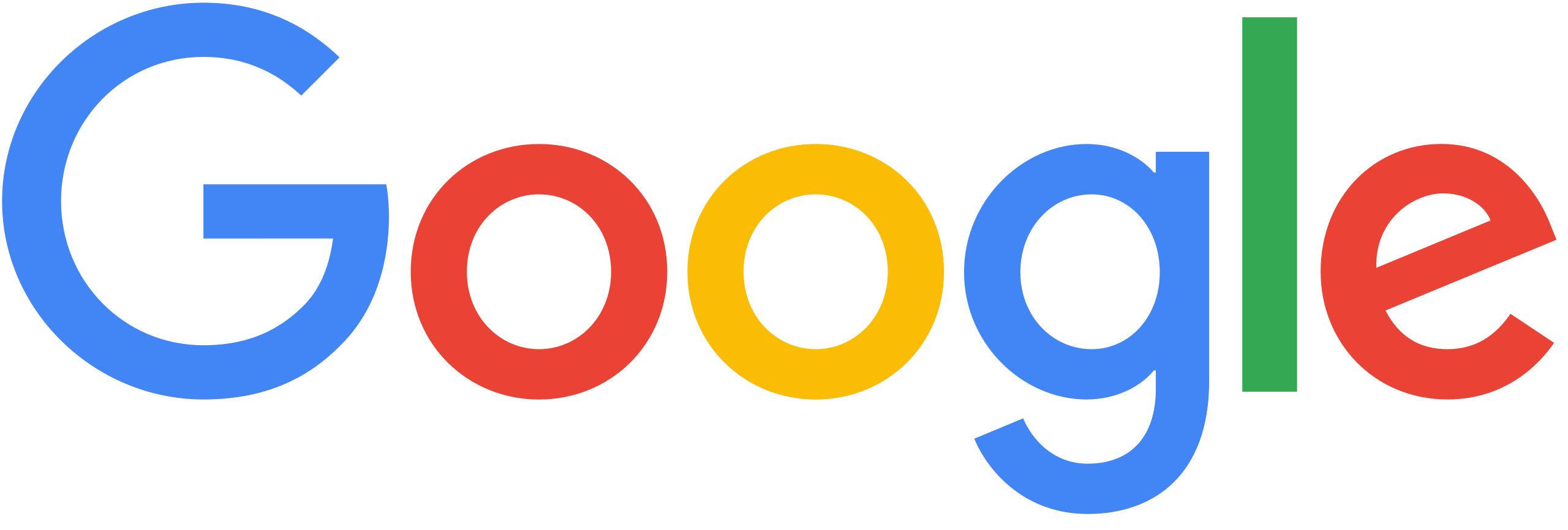
A logo that spells out the brand name using custom typography. Think Google or Coca-Cola. Clean, direct, and easy to recognize—especially effective if your name is unique.
Lettermark (Monogram)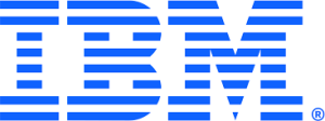

Initials become the star. This minimalist style is ideal for brands with long names. IBM, CNN, and HBO make powerful use of lettermarks.
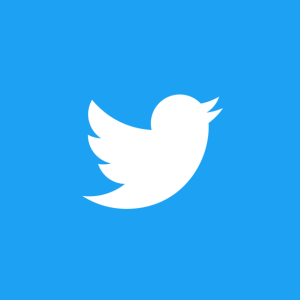 Pictorial Mark (Brand Mark)

An icon or graphic symbol that represents your brand. Think Twitter’s bird or Apple’s… well, apple. These logos work best when your brand is already well-known.
 Abstract Mark

An abstract geometric form that becomes uniquely yours—like Nike’s swoosh or Pepsi’s circle. These logos require strong brand-building to gain recognition but offer great visual flexibility.
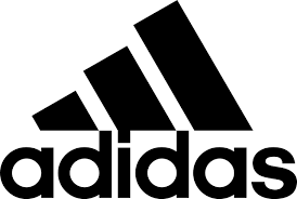 Combination Mark
Text plus a symbol. It’s the most versatile type and widely used—like Adidas or Burger King. Great for growing businesses that want the best of both worlds.
Emblem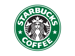
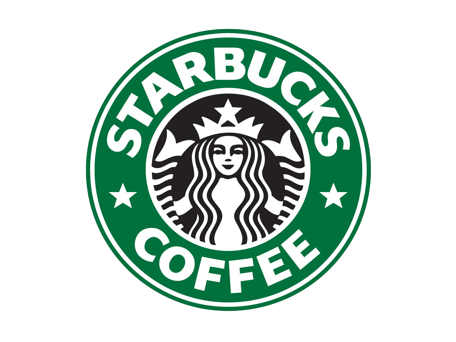
Text enclosed within a symbol or badge. Think Starbucks or Harley-Davidson. Emblems often have a classic, authoritative feel.
Is Your Logo Doing Its Job?
If your logo feels out of sync with your business or your brand’s evolution—or just doesn’t resonate with your audience anymore—consider a refresh. A well-designed logo should be recognizable, scalable, and timeless.
Need a fresh set of eyes on your current logo? Let’s talk.