Logo Trivia
Updated: August 3, 2010 • By Lena Shore
Filed under: General
I had a friend pass this along to me recently and I thought it was very interesting. We spend so much time seeing well known logos, but don’t actually “see” them.
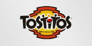
Tostitos

If you look in the middle of this Tostitos logo, you can see that the “Ts” make two peoople enjoying a bowl of salsa.
Formula 1

The red graphic lines and tilt of this logo represent speed, but did you notice the numeral “1” in the negative space creates the black “F”?
Milwaukee Brewers

In this logo the “M” and the “B” make up the baseball glove. The “B” is the thumb and palm and the “M” are the fingers.
Northwest Airlines

The “N” and “W” in Northwest are combined to create the logo mark on the left. The small triangle and the “N” also create a compass pointing to the northwest. Pretty smart!
Amazon

The yellow arrrow underneath the word “Amazon” looks like a smiley face. But more importantly, it connects the “A” and the “Z” to suggest “We carry everything from a to z”. Clever.
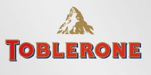
Toblerone

Toblerone is a chocolate-company from Bern, Switzerland . Bern is sometimes called ‘The City of Bears’. They have incorporated this idea in the Toblerone logo, because if you look closely, you’ll see the silhouette of a bear in the center of the mountain.
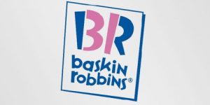
Baskin Robins

The old logo of Baskin Robbins had the number 31 with an arc above it. The new logo took this idea to the next level. The pink parts of the BR still form the number 31, a reference to the 31 flavors.
Sony Vaio

Sony Vaio is a well known brand of laptops. But did you know that the name Vaio logo also had a hidden meaning? Well, the first two letters represent the basic analogue signal. The last two letters look like a 1 and 0, representing the digital signal.
Thanks for u r information
its very useful
This is such a great resource that you are providing and you give it away for free. I enjoy seeing websites that understand the value of providing a prime resource for free. I truly loved reading your post. Thanks!