The Science (and Science Fiction) of DPI
Updated: October 4, 2023 • By Lena Shore
Filed under: Print Design, Productivity, Web Design, Web Development

Don’t use inches when talking about digital images. Only use pixels.
Remember when Han Solo claimed he made the Kessel Run in less than twelve parsecs? And you thought your head was going to explode, because YOU know that a parsec is a measure of distance and not speed?
Okay, maybe you aren’t that nerdy.
If you want to understand the crunchy bits, strap in. I’ll try to fly gently and stop at the rest areas. If you don’t want to read the crunchy bits, there is a cheat sheet at the end. Also, general concepts come first so if you feel like you already understand everything you can stomach, feel free to quit. But if you are the type of person who obsessively wants to understand everything possible (like me), you’re welcome to the whole ride.
The Short Lesson.
If you’re creating an ad that needs to 1680 pixels across, how many DPI is that? PPI? What do you do?
The answer is that it doesn’t matter. Make your ad 1680 pixels across and you’re done. The rest is either a distraction at best or just plain wrong at worst. Ignore anything that says whatever “per inch” and focus on the actual finished size. X number of pixels by X number of pixels.
Moving along …
The Abbreviations
-
DPI = Dots per inch.
- PPI = Points per inch or pixels per inch.
- LPI = Lines per inch
See the “inch” part? Just like there are no bras in space, there are no inches in web development (Yes. I made another Star Wars reference. There will be more). At best, inches are irrelevant. Don’t use them to describe digital images.
- DPI doesn’t matter for digital images. Only pixels.
- DPI isn’t part of the equation for digital images. It just confuses the matter.
- You are measuring apples with a ruler for oranges. It doesn’t work.
- DPI only matters when you need to physically print. It is meaningless to the web.
Pixels vs Dots vs Lines
Pixel means “pictures element”. It is the smallest area of illumination on a screen.
- Get close to your television to see the dots of light. Those dots are pixels.
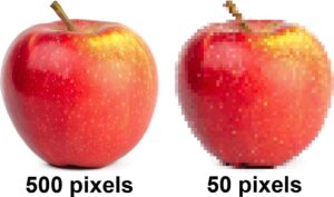
- Have you ever zoomed in on an image until you could see it was made of squares of flat colors? Each of those squares is a pixel. (That’s no moon!)
Dots and Lines are units of measurement for physical printing that determine the final quality. The higher the numbers, the better quality. I could write a lot more on this alone, but frankly, you probably don’t care. It gets really crunchy, and you don’t need to understand it unless you’re running a press. If you are a glutton for punishment, you can always start Googling for more information on printing presses.
A good rule of thumb for physical printing is to make all your images 300dpi (300 dots per inch) when sending it to a press. I say “rule of thumb” because different output devices have different levels of quality. A professional printing press is going to print your brochure much nicer than that inkjet printer you got with your computer for free. You could make your image 1000dpi and it won’t look any better printed on your inkjet than the 300dpi — diminishing returns and all. You just have larger files to store.
What is resolution?
Resolution is the number of pixels or dots you can cram into a fixed space. The smaller the pixels, or dots, the more you can fit in the space. The more pixels or dots, the higher resolution. The more pixels or dots you can use the more detailed your image will look.
- This is why your vintage Atari doesn’t look as good as your new PlayStation.
Pixels can be any size, which is why you can’t measure them with inches.
Let’s use fruit as an example. It’s familiar and not scary. We like fruit.
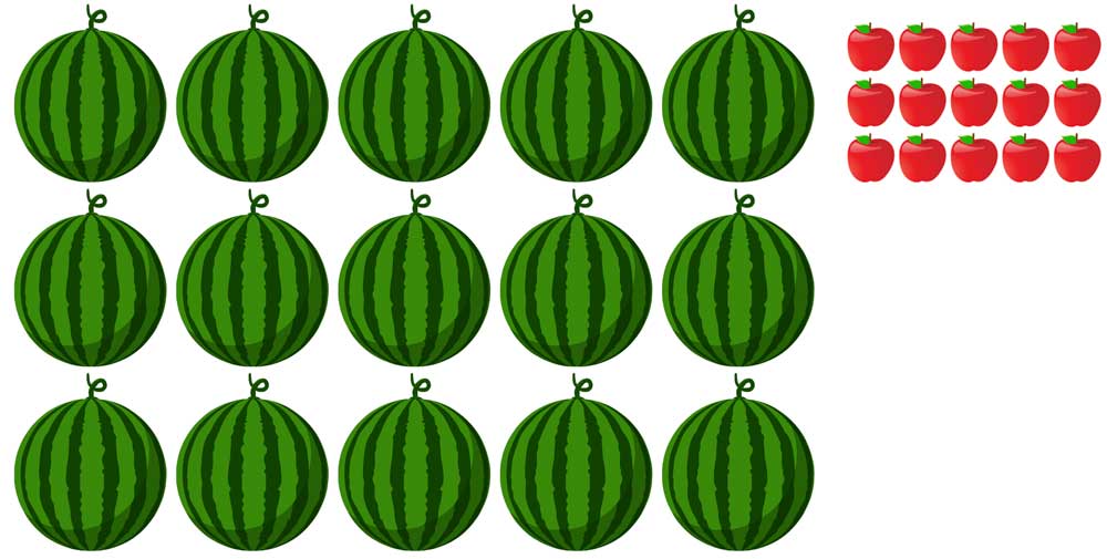
Below, I’ve illustrated a grid of 15 watermelons (5 across and 3 down). I’ve also illustrated a grid of apples. In the physical world the watermelons would take up more space than the apples and you could measure it in inches. But, if each piece of fruit represented a pixel, both watermelons and apples would be the same screen resolution.
Wait? All pixels aren’t the same size?
Nope. Think about your first computer (or cell phone or television) vs the device you have now. Your first device’s screen probably didn’t look that great compared to today’s. We have 100s of devices to choose to own. They all have different resolutions and pixel sizes.
- Scooting closer to your television to watch cartoons doesn’t make the picture quality any better. It just gets your closer to the pixels… which stay the same.
- The cell phone, the tablet, and the monitor in the illustration below show the same number of pixels across. Measuring them with a ruler doesn’t make sense because they are all different physical sizes.
I’ve seen 72dpi and/or 96dpi as a standard. What gives?
History Lesson
From 1737 to 1878 countries across Europe (plus America) created a variety of means and systems to measure printed type. Throughout these changes, the concept of 12 points per pica remained consistent: 6 picas per inch, resulting in 72 points per inch. What kept everything in flux were the very slight differences in the length of different nation’s inches, because boys.
The 72 point per inch printing standard was crucial when Apple developed the original Macintosh computer in 1984, aligning its interface with the physical world.
On the Mac’s 9-inch, 512 x 342-pixel screen, each electronic pixel precisely equated to a 1 x 1 physical point. This ensured that a ruler against the screen would reveal 72 pixels per inch. Consequently, printed images and screen displays matched in size.
As technology advanced, early digital images appeared pixelated, or lower resolution. Improved screens and memory allowed for more pixels on the same-sized monitors. The introduction of raster and vector apps further complicated size matching. (Different means for creating and presenting electronic illustrations.)
Typewriters used a popular 10-point size font. People continued to use “10 point” fonts when switching to Macintosh but didn’t like that the font wasn’t as legible. Microsoft Windows tried to accommodate for increased legibility by allowing users to toggle between 72 and 96ppi on their computers. This makes the “10 point” font 1/3 larger, turning a 10-point font into a 13-point font.
Confused yet? Yeah. You and everyone else.
Takeaway: Don’t use DPI when sizing graphics for the web or digital devices. It is meaningless.
If DPI is irrelevant then why can I see that information on my image’s meta data?
Because the world isn’t perfect? Someone who makes these decisions wants more blog articles trying to make sense of it all? (But not me. I wouldn’t do that to you.)
The 1997 Special Edition of Star Wars depicts Greedo firing a shot at Han Solo shortly before Han responds in kind. In the original 1977 release, Han is the only one to fire.
We have to learn to accept some things.
Fine Smarty Pants… How do I figure out the right size image for the web?
- You can ask your web developer. They will give you a size in pixels (i.e., 576px X 340px).
- Check the spec sheet. If you are creating a digital ad, there is a spec sheet somewhere that will tell you exactly how many pixels your final graphics should be. If it also gives you a measurement of dots or points or lines or pixels per inch, ignore that. It’s extraneous to what you’re doing.
- Check the device size. Determine the width and height (in pixels) of the largest device you want to use your graphic.
- Send the largest image you have. I resize all my client’s images for best use anyway. I prefer they send the biggest image they have, and I take it from there. If you are working with a professional, this might be the easiest (and best) option for both of you.
How do I figure out the correct image size for my printed pieces?
This is different, but I’m happy to tell you anyway. I want you to be the best informed you can possibly be, because I care.
- You can ask your print vendor or graphic designer. They will give you a minimum size. They may give you a size in pixels (because they already calculated the size and DPI) or they may tell you in inches and resolution.
- You can measure in inches the space you need to fill. Then convert that image to 300dpi at the number of inches. So, if you had a photo you wanted to be 3” across by 4” tall, you’d create an image that was 3” x 4” at 300 dpi.
- And yes, you could convert it back to pixels, but you don’t need to.
- Some clients know how to check the pixel size on their images. So, sometimes I might convert this and tell them to only give me images that are a minimum 2500px wide… or whatever size makes sense based on what we are working on. Most people aren’t going to understand how to set up DPI.
What if I’m going to create a document for printing, but also use it digitally?
The printed document is going to require the best quality, so use bigger images for printing. You can always down sample your document for digital if you need to.
If I need an image for printing and the same image for digital/web, why not just use the print image for both?
You could, but you’ll face loading problems on the internet. Larger images “weigh” more with larger file sizes (i.e 1MB, 20KB, 2G, etc..) A larger file will take longer to display/load on a website than a smaller file sized image. If your image takes 60 seconds to load, your visitors will think your site is broken and leave. A properly sized image won’t look any better or worse than its oversized counterpart … so it’s best to use the right size.
What about retina displays? How do I create images for them?
A retina display (or high-resolution monitor) just means more pixels are crammed into the same space. It means we get beautiful images.
If you are creating a photo for a specific retina display, look under the display settings to get the pixel measurements.
As web developers, we know that some people have amazing, beautiful displays and some people don’t.
- We want images to look good for everyone, and …
- We want everyone’s page to load as quickly as possible.
This means creating two images for each graphic. One smaller size image for people with normal displays and another one that is sized for people with retina displays. Programming on the back end determines which image is displayed for the user.
We can’t know the size of every person’s display, so we have to make the best choice we can. A good rule of thumb is to double the size of the image for a retina display. For example: if you need a 500px X 250px image for a normal monitor, you’ll need a 1000px X 500px image for a retina display. (Technically that’s four times the size. No sense avoiding the weeds now!)
Cheat Sheet
| Digital | ||
| DPI | Dots Per Inch | Irrelevant |
| PPI | Points per inch or Pixels per inch | Irrelevant |
| LPI | Lines per inch | Irrelevant |
| Resolution | 300dpi at 100% of the image viewed | 100% of the pixel size needed. (200% if working with retina displays or high resolution monitors) |
| Pixels | It is the smallest area of illumination on a screen. | It is the smallest area of illumination on a screen. |
| Dots (as in DPI) | Unit of measurement for printing. The number of ink or toner dots per inch. | Irrelevant |
| Lines (as in LPI) | Unit of measurement for printing to describe the number of lines of dots per inch. | Irrelevant |
If you felt this article was like deciphering a complicated protocol droid’s translation aboard the Millennium Falcon… don’t feel bad. It’s a complex subject. I’m happy to answer questions to clarify it more.
And, if you’ve wandered too deep into Dagobah without an airboat or a stumpy levitating Jedi master, I’m available for hire!


Thank you, Lena! Having all this information in one place is very helpful. May the Force be with you!
Glad it was helpful! Thanks!