Design Do-Over Diary: Newsletter Critique

January 2, 2024 / Updated: January 3, 2024 / Lena Shore
Filed under: Design Do-Over Diary
Greg D. Little is a client, a friend, and a fantastic author of speculative fiction. He writes the scary, creepy, mysterious stuff people crave, plus the occasional side-splittingly humorous sci-fi. And while you might expect to find Greg living in a dark basement, lit by a single flickering bulb swinging from a bare cord while he bangs away on an old typewriter muttering to himself – you’d be wrong. He is one of the nicest and most approachable people you’d ever want to meet. You can’t see any of that creative darkness from the outside. 😉
And because Greg is so nice, he’s offered to let me use his newsletter as an example of ways you can improve your own, and hopefully teach you some of the design concepts that will help you get more engagement.
You can find out more about Greg at his website by following this link.
The Suggestions:
You can view a larger image of the newsletter by following this link and read the suggestions below or you can watch the video:
- Replace this with your own logo if possible. We don’t want to advertise “airmail”. We want to advertise YOU.
- This header could be larger. This will support adding good size sub-headers further down your newsletter. Make it big. You’re important!
- Increase your font size to at least sixteen pixels. Twenty pixels is even better. This will help with readability and makes your newsletter more inclusive for everyone. (20%-30% of your target market has some sort of disability – and this includes wearing glasses!).
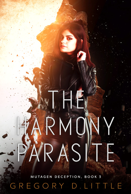
- I like that I can click on this image and purchase the book. But, because it wasn’t labeled that way, I had to guess. You’re selling books here, Greg. Don’t be shy. Create a link that says “To buy the Harmony Parasite follow this link”. NOTE: Don’t ever only say “click this link”. It’s not descriptive enough and isn’t accessible (allows the majority of people to understand and the link if they have disabilities) .
- Breaking up text in your marketing materials helps people absorb your content more easily. This section would be better if you enlarged “A Few Caveats” to make a sub-header
- Changing your dashes into formatted bullets will also make this easier to read. Notice the numbers in this section. See how they are formatted so they stick out away from the copy? You can do this with bullets too.
- I want to know more about Springer! Maybe a short description? Or a link to more info? Springer is a fun idea and I want more!
- “Springer’s Books of the Month” could be treated like the other sub-headers. Or put a divider line above this section to really separate it. Maybe even a very very pale gray box behind the entire section to separate it from the rest of the newsletter.
- There’s no contact or website information on this newsletter.
- The hanging “us” is called a widow. As a designer it makes my eye twitch, but even a non-obsessive reader will appreciate the cleaner lines if you fix it. How about adjusting the copy or the width of the column so it doesn’t wrap awkwardly.
And that’s it! This is a strong start with a bunch of eye-grabbing elements, we just need to emphasize them a little more so people will find them. Great job, Greg, thanks for being my very first test subject, and good luck!

Best newsletter ever!!