Bad Design: Things You Shouldn't Do
Updated: August 26, 2009 • By Lena Shore
Filed under: Print Design

Okay. I admit it. I wish I had a “magic” red magic marker that I could mark billboards, newspapers, magazines, and television commercials. There are just some things that really bug me in the world of typesetting and design. Some are just bad design. Some are because no one delivered a pamphlet to our front doors telling us the news.
Below, I am listing some things to avoid if you want to be a better designer or if you want to flaunt your superiority complex over someone later.
- Stop using double spaces after a period. This is also called “French Spacing”. If you are using a typewriter, it is acceptable. If you are on a computer it is not. The reason it used to be done this way was because all letters on a typewriter take up the same amount of horizontal space. With everything taking up the same amount of space horizontally, your eyes needed a bit of help to distinguish between sentences and make reading easier. Computers changed all of that with automatic kerning (the space between letters). Your grandmother may approve of double spaces, but the computer generation does not.
- Stop putting black text on red. I know what some of you are thinking — “Red is bright!”. Correction: “red is dark” and there isn’t enough contrast between red and black to be seen easily. To prove my point, look at the images below. Two of them have been converted to grayscale so you can see the contrast difference even more! See how much easier to read white on red is as opposed to black?

- Font bashing. I know your computer came with all those fancy fonts and you want to use them. Just please don’t use them all on one project. A good rule of thumb if you want to mix font families is to stick with one san-serif font and one serif font. Mixing too many fonts just looks tacky and unprofessional.

- STOP USING ALL CAPS. This isn’t a hard and fast rule, but there are lots of other options than typing in all caps — consider them. You can bold or make your type larger. All caps is much harder for people to read and should be reserved for headlines and special instances. Besides, it makes it look like you are yelling.
- Don’t use a script font for small type. Script fonts are those nice curvy fonts that look like they stepped out of a romance novel or the diary of some inexplicably literate farmer’s wife on the heaths of merry ol’ England. Script fonts are many times the same as display fonts. This means you should only use them very large. Small versions of these cause eye fatigue for the reader. Imagine having to read a novel in a script font. Now imagine poking yourself in the eye with a sharp stick.
- Do not put a script font in all caps… ever. You will go straight to design hell.
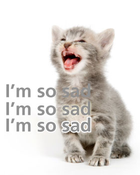
- Consider readability when placing type over an image. Sometime after amateur designers figure out they can put text on top of an image, they forget their primary purpose. If a doctor’s creed is to “do no harm to the patient”, the designer’s creed should be “deliver the information easily”. This means make it legible. If you place type over an image make sure you can read it. You might need to move the type, change its color, or add an effect to make the copy pop. See how in the example below each line gets easier and easier to read?

- Don’t be a car salesman. Not everything on the page is the most important. If you make everything bigger and brighter, and bolder — nothing will stand out. Sure, a plastic ball out of the McDonald’s ball pit might look nice and bright in your hand – but how bright does it look when you throw it back in the ball pit with all the other balls? Can you even find yours? Pick your most important message and make that stand out the most. If everything is so important that it needs to “stand out the most”, you need multiple pieces.
- Know your dashes. It’s everywhere. Instead of the double-dash (–), use an em-dash (—) instead. An em-dash is a long dash used to separate thoughts in sentences. Hyphens (-) are short dashes used to hyphenate words. En-dashes (–) are used in dates and times like 8:00 p.m. – 9:00 p.m. All keyboards come equipped with endless amounts of these special characters. Learn the difference and be superior.
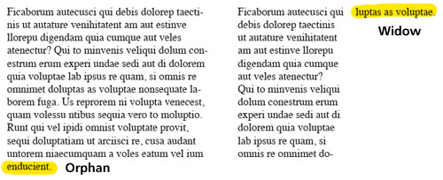
- Take care of the widows and orphans. Widows are single lines of a paragraph at the top or bottom of a page all by themselves. Orphans are single words on a line by themselves. Learn to use your tracking to save the widows and orphans.

- Don’t use images you found on the web for something you are printing. Let’s get a little technical. When you print something on a press, your images are converted into teeny tiny little dots. They are measured in dots per inch (DPI). A press needs an image to be 300 dpi to look nice and clear. A web image only needs to be 72 dpi to look clear. If you take a web image and print it, it will be fuzzy, or pixelated and your project will look bad. It may look pretty on the screen, but if you print it, it won’t look so pretty. The exception to this rule is special images you get online that you download specifically for printing purposes — but if you run across one of those you are sure to know it.
- Don’t design in the wrong color format. If your final product is going to be printed, you need your document to be set as CMYK. (Cyan, Magenta, Yellow, and Black, or “print colors”.) If your final product is going to be on the web, you need your document to be set at RGB. (Red, Green, and blue, or “screen colors”.) Not doing this will cause color problems and could cost you more in prepress to fix it.
- Don’t use these fonts: If you use Comic Sans or Zapf Chancery everyone will know you are an amateur. There are more fonts on this list, but these are the biggest offenders. These fonts come on every computer and all designers know it. If you use any font that is the name of a city, you aren’t using a real font… kinda. Fonts with city names (Monaco, Chicago, New York, etc) are not meant to be printed. They are screen fonts. If you print something with one of these fonts it will just pull it’s “to-be-printed” font counterpart and print with that font and you could experience some shifting problems.
- Beware of Photoshop filters. Yeah, photoshop filters are great…when used properly. Next time you notice some graphics and immediately think “Photoshop” you’ll know they did it wrong. Good Photoshop work isn’t noticeable. Bad photoshop work has websites dedicated to how stupid it looks.
- Don’t Design Logos in Photoshop. If you are designing your company logos in a rasterized/pixel based program (Adobe Photoshop) you are going to have issues down the road. Trust me. A proper logo is designed with a vector based program (like Adobe Illustrator). If you design your logo in Illustrator, you can make it as big as a billboard and it will look great. If you design it in Photoshop, it will look fuzzy, or you will have a image that is too big to do anything with.
Now, what did I miss?
erm, for a graphics / website designer complaining about contrast etc… your ‘home’ button is a tad, camouflaged and hard to find!
(having arrived at this page from Google search and had difficulty figuring out how to get to main site it was attached to….)
Mak – I think you are right. I have added a home link to the upper left where it is more traditional.
Where’s the beer?
Papyrus definitely deserves a mention in the overused font category. I’d never noticed it until xkcd pointed it out and now Ron and I joke about it all the time. The teaser trailer for Avatar used it, even. I was so disappointed.
Oh yeah. You are right about that Papyrus. I too noticed it in Avatar. Cooper Black also was big at one time. Must have come free with some system install.
Amen sister!
I enjoyed the first version. Where is the change?
I think I just rearranged a couple of posts and it must have notified you. Sorry for the confusion.
Okay. I lied. I did go back and edit a bit just now. I found a few typos and grammar that needed a fix and added a link to Photoshop Disasters.