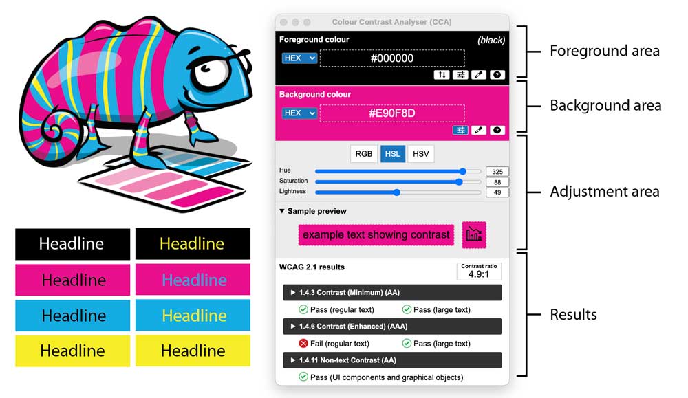
How to use the Colour Contrast Analyser to Check your Website and Screen Documents for Accessibility Color Usage

February 26, 2023 / Updated: February 26, 2023 / Lena Shore
Filed under: Accessibility, Print Design, Web Design, Web Development
What is color contrast and why is it important?
Color contrast is the relationship between two colors when they are next-to or on-top-of each other. Great contrast is readable. Poor contrast is not. You probably never gave it much thought but there is a reason that a stop sign is red with white lettering — because it is readable. A red sign with black text would not have the same contrast or readability. It is important for accessibility and readability.
There are lots of tools to check your color contrast, but the Colour Contrast Analyser (CCA) is one of my favorites.
Where Can I find it?
The CCA is a free download that you can get from TPGi for Windows or Mac.
How do I use it?
Below is a quick introductory video. In about 3 minutes you’ll be able to start checking your work!
This article is part of a series of monthly articles I will be posting on accessibility and how it relates to our websites and marketing materials. They will cover how it affects you, why you should care, pitfalls, and what you can do about it.