Do you have a mobile version of your website?
Updated: December 12, 2011 • By Lena Shore
Filed under: Internet, Web Development, Wordpress, iPhone

What does having a mobile version of your website mean?
You may have heard talk about having a “mobile friendly” or “mobile version” website design.
Mobile Friendly
A mobile friendly website design means that your website looks good on a mobile device such as an iPhone, Blackberry, or iPad. You would also want to avoid programming that would not work well on a mobile device, such as Flash.
Most smart phones are pretty, well, “smart” at showing your website the way they appear on a computer as long as your design was created with current website technologies. Your website is usually reduced to fit and can be zoomed in to read when needed.
Mobile Version
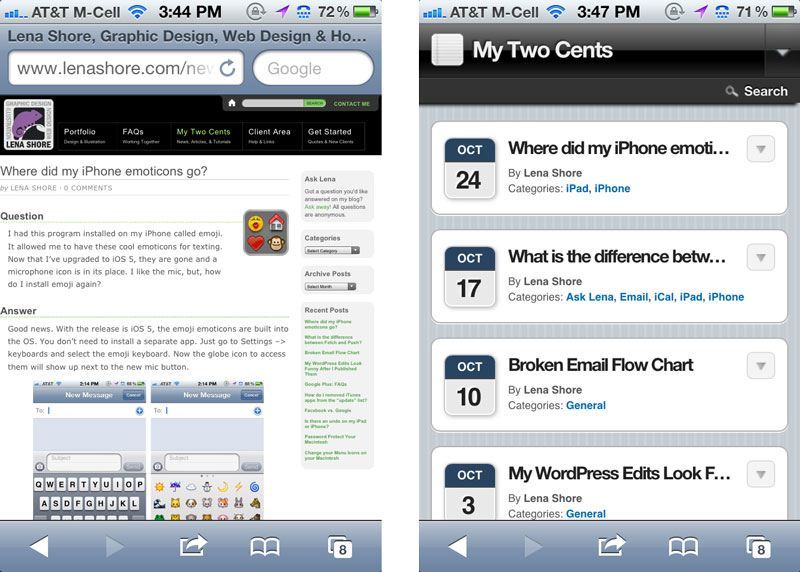
A mobile version of your site means that you have a specific web design that is triggered when your website is viewed from a mobile device. It happens automatically for the user. The goal of the design is to be easy to read on a mobile device. This may mean removing animations, dumbing down the navigation or removing excess design.
There are a couple of ways to implement this.
- New design: Create a specific web design for your mobile device and instruct your website to see where the request is coming from so that it displays the correct version.
- Tweak existing design: Tweak your current design so that it works better on mobile devices. If your site was created in the last couple of years, this might be a good option.
- Add a plugin: If your website is on a content management system (like WordPress) there are some excellent and inexpensive plugins that will make it happen almost auto-magically.
So, what might it look like?

Good article Lena because I’ve been seriously thinking about a mobile website for a bunch of my customers. Thanks for showing the images too so I get a visual of what it might look like…I’ll have to add these to my new years resolutions! 😀
You are quite welcome. Glad it was helpful!